Designing a better VOGUE Experience
A UX Case study of Vogue's Digital iOS app
OVERVIEW
It so happened that on my 25th birthday I got a digital subscription to Vogue. I was absolutely overjoyed and religiously used it every day while commuting to school, during coffee breaks, before bed you name it! But even after diligently using it for over a week, I still had problems navigating through the app. I have a master's in Information Technology it shouldn't be this hard I thought. I then figured that if I was facing these problems plenty of others would too. So I then quickly dialled up my friends for their opinion and went online to do brief research. There were many issues regarding the app's lack of a friendly user interface.
Through usability testing I got to know that plenty of people struggled with the navigation. The navigation simply wasn't clear enough, nor was it friendly. I took upon myself to I revamp the app as an opportunity to provide the users what they really want: a VOGUE experience.
Disclaimer: I am not affiliated with VOGUE in any capacity
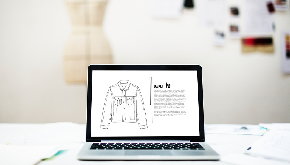
Current Vogue iOS app
OBJECTIVES:
-
Facilitate a better user experience for digital vogue by improving its UI.
-
Improve my skills a designer and design a more personal intuitive user interface.
-
Design through User Empathy
-
Learn how to analyze user / customer research, create flow charts, wireframes and prototypes.
ABOUT VOGUE AND ITS USERS:
Before I began this case study I wanted a thorough analysis of "Vogue" as a brand. For over 125 years Vogue has been a highly influential authority on Fashion, Beauty, Couture and Culture. Currently there 22 editions of vogue printed worldwide.
Target Audience
Vogue's target demographics were mostly women between the ages of 18-45. These include women who work in the fashion and cosmetic industry such as models, publishers, designers, photographers etc and young women who are simply interested and would like to be up to date with the latest novelties in Fashion and Beauty.
As of 2020 vogue boasts over 24.6 million users worldwide. Out of all the users, 18% are male while 82% are female.The current users of digital vogue is a whopping 94.1 Million while the users of the print edition are 24.6 Million.
In the continental US alone there are 13M unique users of digital vogue.
Online Survey


I also conducted an online survey to further understand user needs and requirements. The respondents are between the age group 22-30. They were all females with varying professions such as college grads, software developers, architecture students etc. The respondents seemed to be a fair representation of vogue's users.
Online Survey Results
User Research
My next step was to hit the app's Review on the app store. People have the most honest opinions of their experience there. Below are some of the screenshots of the reviews I read


Screenshot from app's review
Some the complaints that really stuck out were:
-
Not user friendly
-
Confusing to navigate
-
Difficult finding the "home"
-
Non intuitive
ANALYSIS:
Affinity Map:


I used affinity mapping to group similar observations together.This helped me identify and highlight several key insights that came up during the interview.
Me attempting to make sense of all the data collected.
2x2 Matrix
The 2x2 matrix helped me better understand the relationship between the user and the business which further helped me prioritize which issues to address.

User Persona:
I created a user persona that best describes Vogue's typical user.The persona I developed was roughly based on all the users I interviewed.

REDESIGN PROCESS
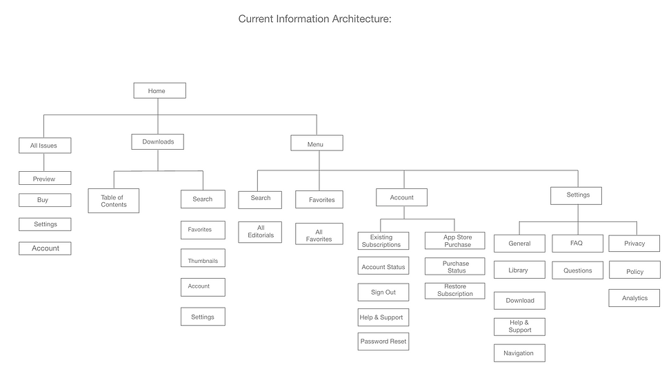
Current Information Architecture
The area where most of the user shad trouble using the app was with the navigation. The Vogue app also includes a "how to navigate" feature in its settings so that users can use to for guidance. I believe that a good design would not make the user forget about it in the first place. Therefore in order to redesign the navigation better I built the information architecture to understand it better for which I used the card sorting method.

Revised Information Architecture
The newly revised IA not only improves the overall structure and organization of the app thereby making the navigation easier, it also increases the visibility of the app's key features.

Ideation and Low fidelity proptypes
I first tried out all my initial ideas and sketches out on paper. This helped me through the iteration process and figure out all my options before I settled on one.


Low Fidelity prototypes
Wireframes
I designed the initial wire frames keeping in mind all the issues discussed above. I then put these wireframes through testing using techniques like contextual Inquiries and Heuristic evaluation before committing to the final design.

UX REDESIGN AND SUGGESTIONS
Experience 1 - Homepage homage
The current homepage of the app appears to be bulky. The elements are placed so close to each other, leaving no breathing space which can be pretty confusing for the users. So I decided to include a "grid" button that would enable both list view and a grid view.

Before
After
Before
After
Experience 2 - Hamburger vs Kebab
Most of the essential features of the app were hidden way in a kebab menu. The elements were placed in a unorderly, haphazard way which made it difficult for users to remember each element's place. So I decided to redesign the menu and organize it's content in a more conventional manner. I relied heavily on the card sorting method for this particular redesign.
Before
The menu headlines were misleading and there were not proper option to view "help"
The current menu option was like a maze to navigate through. Most of the users did not know where to go see their subscription.

I rearranged the entire app and resurfaced all the hidden menu options out in the clear opt into these 6 menu options


After


Separated and placed all the features under an appropriate menu tag to avoid misinformation.
Before
The table of contents option is placed on the top left corner, which makes the steps to access it as 2.
1.Swipe down for menu
2.Tap for contents


The kebab menu on the right reveals hidden features some of which are not needed while reading. For. eg the account and settings options isn't
necessary for the user and can always be accessed from home.
After
I split the hamburger and placed the slices in a tab bar to allow for easy access and thus reducing the accessibility step as 1 from 2
Placed home on top right corner to increase flexibility and accessibility.
Experience 3- The scrolling scandal
This was one of the most confusing part of the app, "the scroll up" to get the menu options.
When a user reads, he tends to scroll down. So scrolling up to get the table of contents and other menu options goes against the direction of reading which makes the user lose sight of what he's reading. So I decided to implement the traditional tap to view option. This will make reading much easier and provide a comfortable access to the menu options.
Before
After
Swipe down to view menu option
Tap to view menu option

Experience 4- The curious case of preview button
The current app did not have a visible "preview" button present. Users aren't made aware instantly that they can preview the magazine before buying it. I deduced that the chances of a user buying a magazine or a subscription increases if he/she "previews"it first. Hence I decided to incorporate the preview in the homepage right where the user can see it!
After


Before
The preview page also
lacked all the necessary
CTA buttons, users aren't made aware
of the subscription option which is also available.


Before
The preview button is placed right below the magazine so that the users are made aware of its availability
The current preview page features all the necessary CTA buttons such as the subscribe, view plan or buy
Experience 5-The table of contents tableau
The table of contents is one of the important part of navigation. It helps users navigate between the pages and aids them in browsing through topics. The current app uses a "swipe down" feature to get to the table of content options as talked about in experience 3. To make things simpler I included a "tap on the left side of the screen" to get the table of contents.
The toc, currently uses a 2 step process to get.
1. Swipe down for menu
2.Select toc option

Also, the table of contents itself does not have a back button so its hard for the readers to go back to what they were reading.
After
In the new prototype I reduced the table of content as a one step process.
When the users tap on the left most side of the page the Toc, reveals itself.
Also I placed a back button so that users can get back to what they were reading, thereby increasing the flexibility of the interface
Experience 6-The personalization paradox
One of the most important aspect for a user is for the app to be personalized. Thats what sets them apart from hundreds of others who use the same app. When an app has a profile, or uses the users name and/image it can have a positive impact on the user which further increases brand value. Who doesn't like to be greeted personally? The lack of personalization in the current app seems to be a bit off-putting. There isn't so much as a users' nemail id let alone the users name present anywhere. The user has absolutely no idea who's account they're on.
Before


After


Experience 7-Favourites!.....or lack there of
The current navigation to favorites is a bit long and I felt that it could be made much simpler.
Before
After
Experience 8-Loading screen runway
Nobody likes a loading screen, it makes the users impatient and irritant and I believe nothing is worse than a static loading screen. In such a case the user isn't aware of whats happening which blatantly ignores Norman's heuristic principles on "Feedback". So I ever so slyly introduced a bit of animation into it like so.

The redesigned finished product
Reflections on my work
I absolutely loved working on this project. It was exciting right from the beginning. This was my perfect opportunity to hone my design skills and make myself better. I wanted to do a thorough job so I took the process slowly. I had a great time working on this project and now that it is done I feel a strong sense of accomplishment.
Design is the intermediary between information and understanding.
Thank you for taking out the time to read this!